Rose Mary Roche
  • Home
  • About
  • Blog
  • Contact
  • Journalism
  • Styling
Sub Rosa
sʌb ˈrəʊzə/
adjective & adverbformal
​​
happening or done in secret.
"the committee operates sub rosa"
synonyms:    in secret, secretly, in private, privately, in confidence, confidentially, behind closed doors, surreptitiously, discreetly, furtively, clandestinely, on the quiet, on the sly, unofficially, off the record, between ourselves; in camera; à huis clos; in petto; informalon the q.t., between you, me, and the gatepost/bedpost; archaicunder the rose
"the committee is accustomed to operate sub rosa"
Origin
Latin, literally ‘under the rose’, as an emblem of secrecy.
the power of colour

23/2/2018

0 Comments

 
Picture
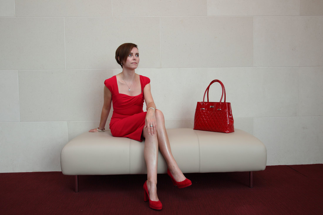
Me in head to toe red, not a typical look. Image courtesy of The Gloss magazine.
 
“Mere colour can speak to the soul in a thousand different ways.”
Oscar Wilde
 
The scent of Spring in the air has spurred on an untypical desire for colour in my wardrobe. As a fan of the classic masculine palette of typically neutral shades such as grey, navy, charcoal, camel, chocolate and black, this leaning towards brighter colours has been creeping up on me gradually. It might be the quality of our February daylight, the sense that I am jaded with dark shades after 4 months of a sombre winter palette, or maybe it is down to the feeling that my pale winter complexion is in need of a serious boost, but I am craving colour. The current exhibition at the National Gallery of Ireland: Emile Nolde – Colour is Life is also inspiring me with its vibrant, colour palette and vivid saturated hues. This expressionist artist painted with such energetic gusto that his paintings seem to pulsate with life. Golden yellows and deep reds appear frequently in his work, giving a luminous quality to otherwise sombre tones.
 
My appetite for colour is reflected in the general fashion trends for Spring/Summer 2018, with Pantone predicting a palette of 12 singular shades for the season encompassing colours with evocative names like Palace Blue, Nile Green, Meadowlark, Ultra Violet, Rapture Rose and Lime Punch. This trend for bright colour may be interpreted as a reaction to a grim political climate which encompasses Brexit, the refugee crisis, Trump and a general air of anxiety and unease about rising homelessness, a compromised health service and upwards interest rates. Fashion has decided that the antidote to this gloom is a vivid injection of colour and while this may be a simplistic solution to some, colour has a profound impact on our emotions. There is also a desire for experimentation in the ether – with gender stereotypes breaking down and a growing desire for self-expression among consumers rebelling against homogenous trends, colour is proving a political weather-vane. Think of the pink pussy hats of women protesting Trump, the black dress code observed on the red carpet at the Golden Globes and the BAFTAs and the use of the LGBTQ+ rainbow in Christopher Baileys’ last Burberry show.  Prada’s recent A/W 2018 fashion show in Milan also featured dazzling defiant fluorescent colours, cited by Miucca Prada as an expression of freedom: “I imagined that a woman could go out looking super sexy in the street at night without being bothered. It’s about the freedom of women to go out in the night.”
    
Colour speaks a powerful language that transcends mere words. It can convey political, social, sexual and economic messages in an instant. Historically we can see the importance of colour in defining social status (purple was once reserved exclusively for nobility and royalty), political aspirations (the Suffragettes wore white) and sexual status (the famous red dress worn by Scarlett O’Hara in GWTW branded her definitively as a wicked woman). It was Coco Chanel who transformed black from the colour of mourning to a fashionable staple, and while she endorsed a monochromatic palette for most of her career, black as we mature can be ageing and draining.
Picture
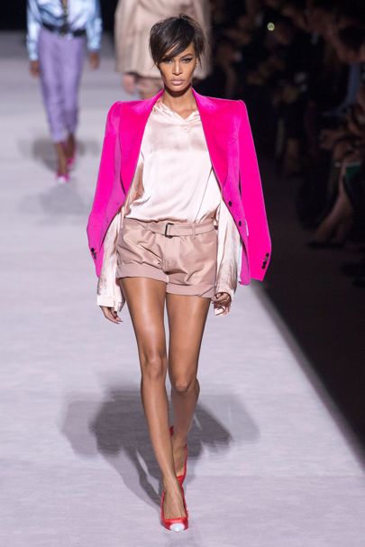
Tom Ford S/S 2018 showed saturated colours juxtaposed against pastels beautifully. Image courtesy of Vogue.
What I have noticed increasingly as my own face alters with age is the profound lifting impact that colour can have on my complexion and appearance. While I am not a fan necessarily of the rigid rules of colour analysis, I do believe that we need to review our taste in colours as we experience mid-life. I often hear women complain of their growing “invisibility” as they navigate middle age but perhaps this is not helped if you choose to live only in bland beige or subdued neutrals. If your wardrobe, hair and skin tone all adhere to the same palette, then you can fade away into visual oblivion. Announcing your presence with a splash of bold colour is one definite way to confront this invisibility and ensure that you register with people. It can take courage to wear colour confidently but becomes easier with each dip into a brighter palette. Beige can be very habit forming and while subtle tones are easy to match and wear, they can also become a way of blending in instead of standing out.
 
Choosing colour is synonymous with the Buddhist tenet to “Choose Life”. Once you are wearing colour more regularly, you begin to appreciate the impact it has on your mood, and on the responses of people that you encounter. People engage with colour, they are drawn to it and will comment on it enthusiastically. In a social situation, it will not only get you noticed but can also be an effective ice breaker. I am not advocating wearing colour head to toe – this is not for everyone, but using colour to lift and add zest to your existing wardrobe. If like me you have a wardrobe of neutrals, then look at the amazing colour combinations that you can create with the addition of some new colourful purchases. Experiment with red and navy, turquoise and navy or burnt orange and navy. Consider burgundy and camel, red and camel or orange and camel. What about pink and grey, lilac and grey or aqua and grey? I find it is easier to keep colour to tops, knitwear, scarves and accessories or even a manicure, and work these against your trustworthy classic basics. That way you get to continue wearing the pieces that you love and have invested in while also adding variety to your wardrobe. This strategy of adding pops of colour is life affirming, mood boosting and allows you to introduce colour in a way that doesn’t overwhelm.
Picture
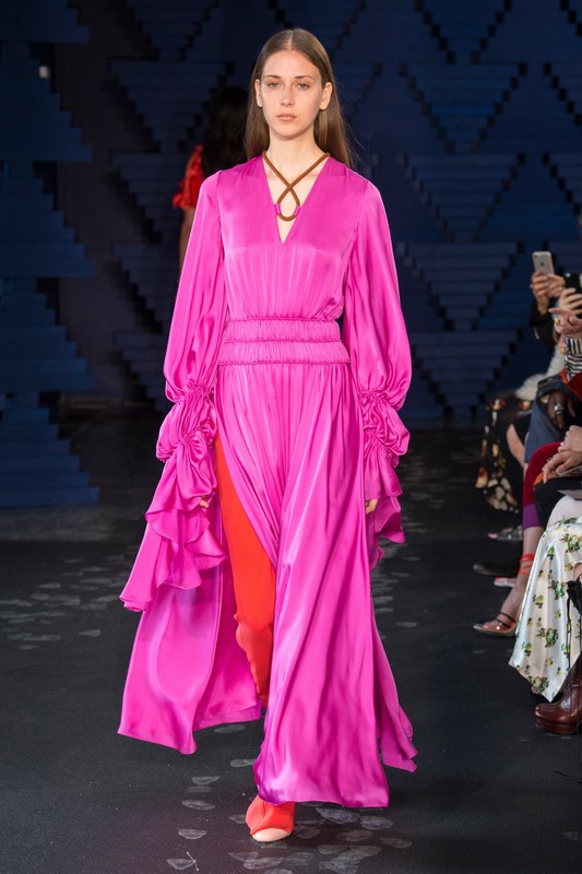
Roksanda Ilinic S/S 2018 showed clashing vibrant hues. Image courtesy of Vogue.
Judging which colours work for you can initially be difficult. After all, the spectrum of shades is wide and if you haven’t been wearing any colour, making the decision to invest in colourful clothes and accessories feels unknown, even frightening. If you feel totally defeated by the prospect, then you can book an appointment for colour analysis with a professional, but even on your own you can start by being braver and trying on colours when you shop.  Hold colours up against your face and observe how different shades affect your eyes, skin tone and overall appearance. With practice, you will start to notice how certain colours lift you and make you look fresher while others, drain you, emphasise under-eye shadows and make you look tired. Take note of the colours that enliven you and see if they have warm or cool undertones. Warmer skin with a yellow undertone is flattered by golden shades of yellow, red, orange and deep turquoise while cooler skin with a blue undertone favours hot pink, ruby red, navy and cobalt blue. Turquoise is apparently the most universally flattering shade so if in doubt it is a good colour to try first.  
 
 With perseverance, you will gradually educate yourself about what suits you. Generally, neon yellows, acid greens and mustard tones can be hard on fair Irish complexions so exhibit caution when attracted to items in these shades.  Choose to enhance your skin-tone rather than fretting about lines and wrinkles: good colour choices bring vitality to your face, brighten your eyes and magically lift your complexion better than any "miracle" cream.  Also remember Christian Dior’s observation that “Two colours in any outfit are quite enough”. It takes a skilled eye to combine colour and pattern, so limit your palette and you will be less likely to tip over into clown territory.
 
Be mindful of what our choice of colours conveys to others: if you constantly dress in black, what are you saying about your state of mind and sense of self-belief? Yes, it can be slimming, chic and versatile but it can also become an unimaginative uniform into which we disappear. On the other hand, someone who adapts colour and adorns themselves with optimistic yellow, calm blue or radiant red delivers an utterly different message about themselves. Whichever colour you choose, remember that it will not only elevate your appearance but also your mood and self-confidence. By re-claiming your visibility, you are stating your right to be acknowledged and valued as a relevant person. It doesn’t matter what the colour is, as long as it makes you look fabulous.
 
 As the wise Chanel observed: “The best colour in the world is the one that looks good on you.”

Picture
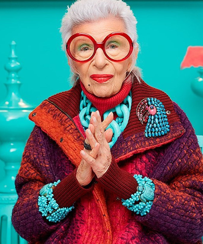
Iris Apfel, the ultimate Colour Queen shows how it is done. Note the turquoise. Image courtesy of Instagram.
0 Comments

Your comment will be posted after it is approved.


Leave a Reply.

    Author

    Rose Mary is a fashion and media professional with over 25 years combined experience in both fields. She has a special interest in style for women over 40 and writes in her blog about fashion, beauty, lifestyle, wellbeing and popular culture. 

    Categories

    All

    Tweets by RoseMaryRoche
Proudly powered by Weebly
  • Home
  • About
  • Blog
  • Contact
  • Journalism
  • Styling